
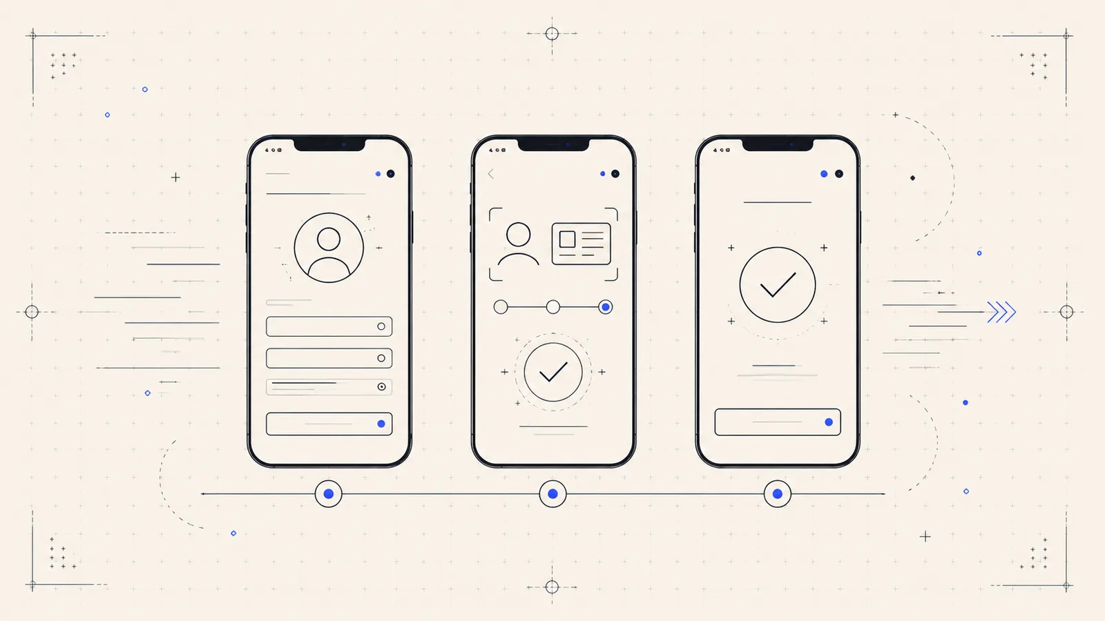
Onboarding is where a fintech earns or loses a customer, and this one was losing too many at exactly the wrong moment — after the prospect had already decided to sign up. The flow was technically functional, which is often the hardest kind of problem: nothing was broken, so nothing obviously needed fixing. The data told a different story.
Diagnose before redesigning
We started with a UX audit and the client’s own funnel data, not a redesign. The pattern was clear: a long first step that asked for information the business didn’t yet need, error messages that told people that something was wrong but not what, and a front end heavy enough that each transition felt like a wait. Each of those is a place a motivated user quietly gives up.
Rebuild the flow as resumable, accessible steps
We broke the flow into shorter, clearly-signposted steps that a user could leave and return to. Validation moved inline, with specific, accessible error messages tied to the field they belonged to and announced to assistive technology — so the flow got more usable for everyone, not just as a compliance line-item. The front end was rebuilt so each step loads and responds immediately, even on a poor connection. Regulated, sensitive steps kept every control they needed; only the friction that wasn’t doing a job was removed.
The figures here are illustrative of what this kind of focused onboarding work delivers; the client is not named. The transferable point is the sequence: measure where people actually leave, remove non-essential friction, and make the essential steps fast and accessible.
If a signup, checkout or application flow is leaking qualified users, that’s the work our web development and design teams do together. Start a conversation.